Sunday 3 April 2011

Everyone is reading it, except you. (Sorry for bad quality photos)


Images from book stuck in A5 Evening Standard - idea that images of people reading the newspaper is what is stopping you from reading it too. I like this idea, but feel aesthetically the book is too busy, and the message could be lost a little.


Newspapers cut to A5, as a stand for book - looks a bit crap...


FINAL OUTCOME


Thursday 31 March 2011

Final Outcome!?


This is the same as the first book I had printed but with a few changes. I decided to take off my name from the spine of the book as well as the barcode on the back so that the cover is now completely blank - I wanted it to be like this to contrast completely from the front page of the Evening Standard which is more in you face and full of information. Instead of having my name on the spine, it is on the last page - I felt this was subtle but still visible. I have also added a title page on the inside cover, to create an introduction for the rest of the book. At the moment, I'm not sure whether this book is enough on it's own, so I want to think of an interesting way of presenting it in the exhibition - I had the idea to get an Evening Standard news stand and have my book presented in that; I think this would put the book back into context, and hopefully work well aesthetically. The only problem is that I don't know where to find one/whether I will be able to get one at all?

Sunday 27 March 2011

Another experiment


Book no.1 Experiment


The first book I made, I had printed twice because the order of the pages in one of them was wrong. With the copy that printed wrong, I decided to experiment with sewing the pages of the book together through the middle so that you can't open the book fully - similarly to my experiments with the Evening Standard at the beginning of the project. Unlike the newspaper sewn together, here all of the pages are still readable. The idea here was to create the impression that there is missing information in the sewn up pages, even though there isn't. I'm pleased with how this experiment turned out, although I'm not sure about the aesthetics of the book with the blue stitching on the front - maybe if the stitching was white, it would blend into the cover more. I'm thinking of getting more of the first book printed so that I can experiment some more/refine my ideas, as I'm thinking this is going to be my final outcome, although it's not quite there yet!

Saturday 26 March 2011

Book cover/inside page or poster?


This is following on from the stop motion I made - I took the sentence I used in the video and have tried to incorporate it into a poster or maybe a cover for my book? I used the same typeface (or as close as I could find without paying for it) that is used for the Evening Standard logo, in a similar way to the Evening Standard's 'Sorry' Campaign (see earlier posts) so that the poster was obviously about the Evening Standard even though it doesn't say it. The capital E and S in 'everyone' and 'is' is meant to represent the Evening Standard title. I'm not sure how successful this idea is but I think it is something I could incorporate into my book.

Friday 25 March 2011

Sewing newspaper and photos


After having the second book printed, I decided to try sewing the photos I took, to the newspaper image that they mirror, to try and reflect the idea that the Evening Standard is everywhere and difficult to get away from. I'm not sure whether I like the results though - I really like the combination of sewing and collage, and I think they work well as individual objects, but I'm not sure what to do with them now/whether I can develop this idea more...?

Book no.2


This is the second book I had printed - with a combination of photos I took of people reading the Evening Standard and images from the newspaper that reflect/mirror the people in my photos. I really like the concept behind this, but I'm not the collages work best in a book. I think each page works well on its own aesthetically and they show a message/create humour about the news - and although there is a connection between each page, there isn't a narrative in this book like in the first book. Maybe a narrative isn't necessary, but there is definitely something missing in this book that makes it less effective than the first book.

Thursday 24 March 2011

A few more experiments


Stop Motion Idea


Book no.1


This is the first book I had printed - I wanted to keep the layout as simple as possible so the content is the most interesting thing to look at. This is to try and contrast to the vast amount of in-your-face information that is in newspapers. When going through a copy of the Evening Standard, I found that the stories at the beginning and end were interesting, but got pretty dull through the centre pages - all the interesting information is on the outside. With my book, I wanted it to be the opposite - with the interest inside the book, meaning that you have to pick up and actually take time to look through it to understand the content. I am pleased with how this book has printed but it is really manufactured - so I want to make a hand-made version.

Pages from my sketchbook - favourite ideas

One of the first ideas I had was to physically alter the Evening Standard so it becomes more difficult to read/only parts of the newspaper are visible. I then put the newspapers back into their original context (the tube) by taking photos of my friend reading the altered newspapers - the one she is reading here is sewn through the middle of the newspaper so you can only open it at the top and bottom of the page. As another experiment I decided to print my photos on pages of the Evening Standard. I feel this experiment has worked really well aesthetically and to show a message - the images are now less easy to see/distorted slightly; representing the idea that we are all consumed by the news/it's sometimes difficult to see the real truth in news articles.
 This is another experiment I did with the photos of my altered Evening Standard. I really like the way the really narrow newspaper still covers her face - reflecting the way people read papers on the tube (no one looks at each other, hide their faces in their papers). I rotated the photo so that a mirror image is almost created - I think this works well aesthetically, but I'm not sure what I'm trying to say by doing this.
I went out around London and took photos of people reading the Evening Standard. I then had an idea to find photos in the newspaper that mirror the positions of the people in my photos - which is what I've tried doing here. I wanted the photos I took to be in black and white to symbolise the monotony of picking up and reading the Evening Standard everyday. They also contrast nicely to the colour photos taken from the paper which suggest more variety and individuality.

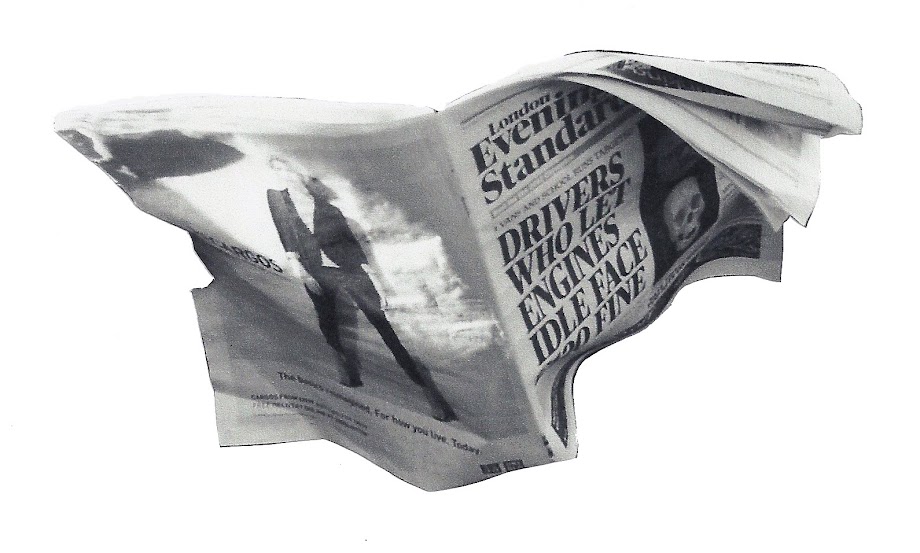
Here I have taken a part of a photo (newspaper) and sewn it over the Evening Standard in this photo to explore the idea that the Evening Standard is everywhere and impossible to get away from. I like the 3D aspect of this, as the newspaper almost seems delicate - think the shape created by the cut out newspaper seems delicate too. Also could be humorous - what's behind the Evening Standard...another evening standard...lol?

Poster Ideas - not sure whether I want to make a poster at all?